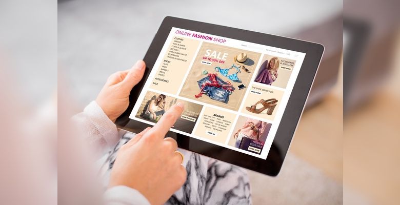
In the world of online retail, it is essential not only to attract the attention of visitors, but also to guide them in a targeted manner. One trick you can use is the so-called Gaze-Cueing-Effect.
What is the Gaze-Cueing-Effect?
People appeal to us. Understandable, because we are also human. That's why advertisers like to focus on smiling men, likeable-looking women or cute-looking children. When they look at us - for example from an advertising poster - we are completely captivated.
Looks attract looks. This is exactly what you can take advantage of by using Gaze Cueing. Guide the viewer by getting them to follow a line of sight.
For Example:
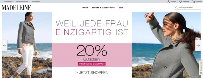

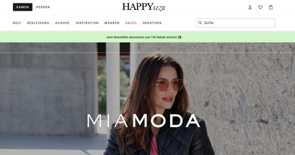
Where do your eyes go when you see the teaser on the fashion retailer's website? First you look at the model - and then you follow the glances. They get stuck on the current discount promotions. No matter how often you look away and back again: They are always "guided" by the direction of the lady's gaze. The Gaze-Cueing-Effect strikes!
How to use the Gaze-Cueing-Effect
Here are a few practical tips on where and how you can use the Gaze-Cueing-Effect effectively:
People instead of emotionless products
No matter whether you are selling fashion, food or technology: Try to use people or animals for your advertising motifs as often as possible. This allows you to "catch" the viewer immediately. You could use the Gaze-Cueing-Effect for your own purposes.
Think about the effect
Always pay attention to the direction of the model's gaze during the photo shoot or when selecting from a stock photo archive. These gazes should convey a message such as "Hello, look at me!" or "Follow my gaze!" Always be clear about what you want to advertise and where each image will be used. This is because you generally need different motifs for a vertically oriented flyer than for a landscape-format advertising banner.
Product photography and advertising images
Use photos of people looking at or using your products. Position the products so that they are in the natural line of sight of the people pictured. This can increase the likelihood that viewers will focus their attention on the products.
Design of landing pages
On the homepage or a category page of your online store, you can use images of people or animals looking in the direction of your call-to-action buttons or important information. This draws the attention of your website visitors to these elements and increases the likelihood of an action - for example, clicking on a teaser.
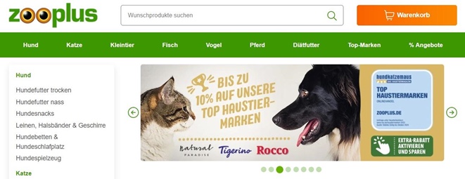

Advertising figures to make you pause
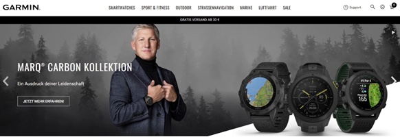
On posters or in your online store, use photos of well-known personalities such as stars or influencers who look the viewer directly in the eye. This makes the viewer feel immediately addressed and can hardly look away.

Do the looks really fit?
Check your choice of motif to ensure that the opposite effect is not created. For example, the model is not looking the viewer in the eye, at an offer or at a call-to-action button, but in a different direction - and therefore perhaps away from your store page. This confuses the viewer.

Carry out tests
Not sure if your product photo and Gaze-Cueing-Effect is working? Run A/B tests or analyze heatmaps to compare different ideas and find out which images and placements are most effective.
Summary
The Gaze-Cueing-Effect describes the tendency of people to automatically follow the gaze direction of others. When we see a face looking in a certain direction, we are unconsciously tempted to turn our gaze in the same direction. Make targeted use of this phenomenon to draw the attention of your store visitors to important content or call-to-action elements!


